CoCreate brand development
CoCreate is a community-focused app concept that reimagines how people discover, commission and create tattoos.
It brings artists, studios and clients into a single, intuitive journey — offering an alternative to today’s scattered, social-led process and focusing on inspiration, connection and trust. App-first in design but human at heart, CoCreate explores how a more considered digital experience could raise standards across the tattoo industry, while celebrating tattooing as a meaningful, global art form.
I was involved at an early stage of development, shaping the brand direction through exploratory logo ideas and stylescapes that brought the concept to life.
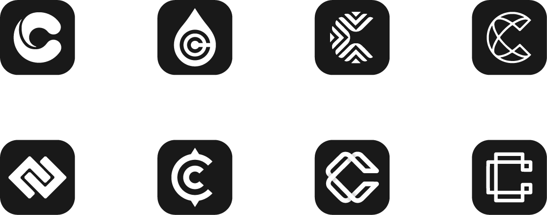
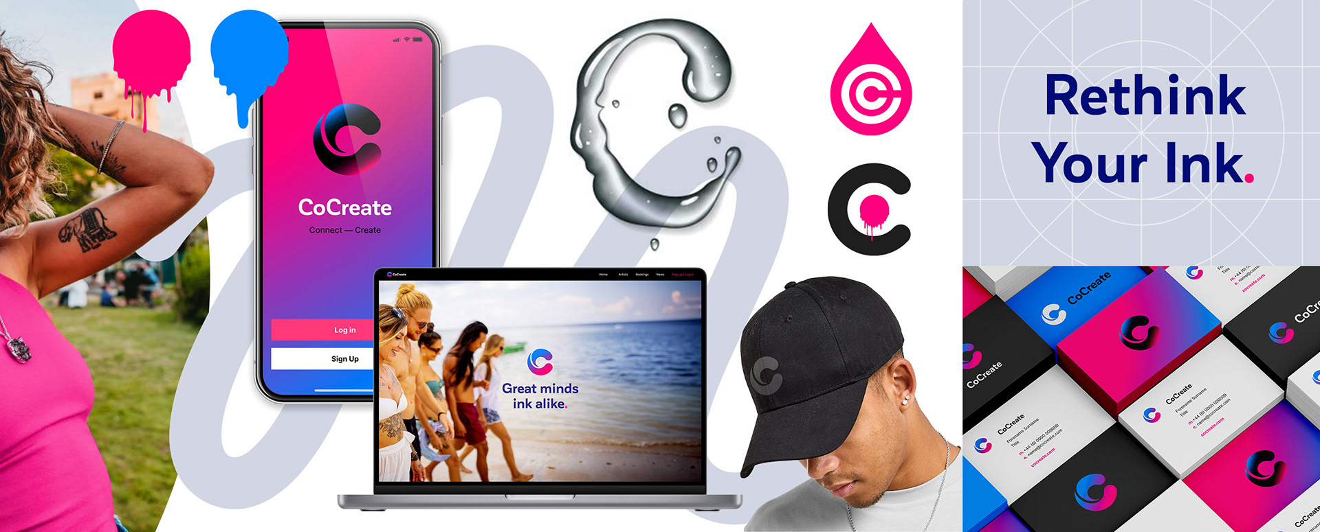
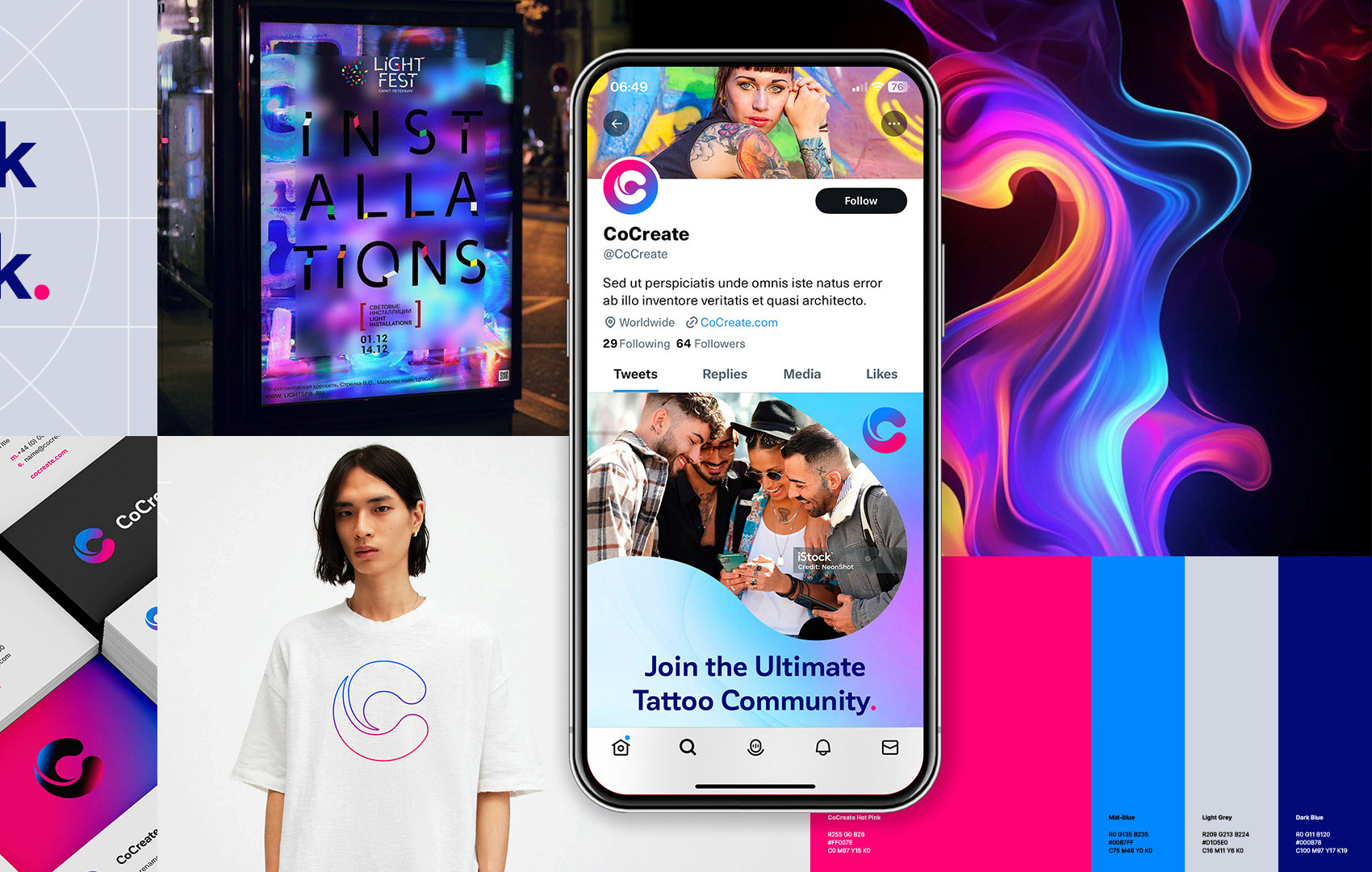
Route 1 - Ink droplets
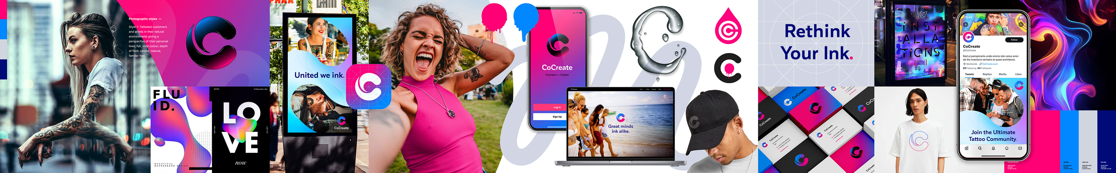
A pair of ink droplets entwine to form the initial ‘C’ of CoCreate, representing the collaborative relationship between artist and client. The identity is bright and contemporary, designed to live comfortably in digital spaces, with curves and freehand lines breaking the grid to create warmth and approachability.

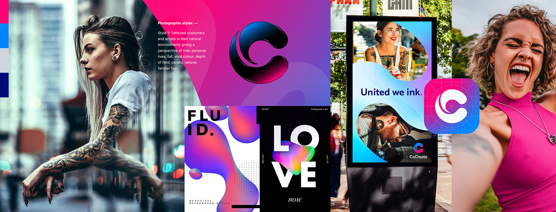
Artists and clients are shown in their natural environments, offering a glimpse into real lives rather than staged moments. Photography is vivid and candid, with shallow depth of field, natural light and occasional humour — designed to feel familiar, personal and inviting.
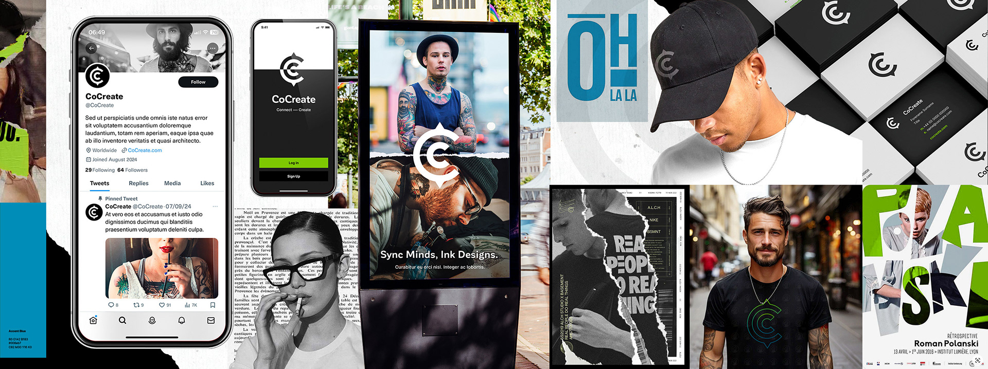
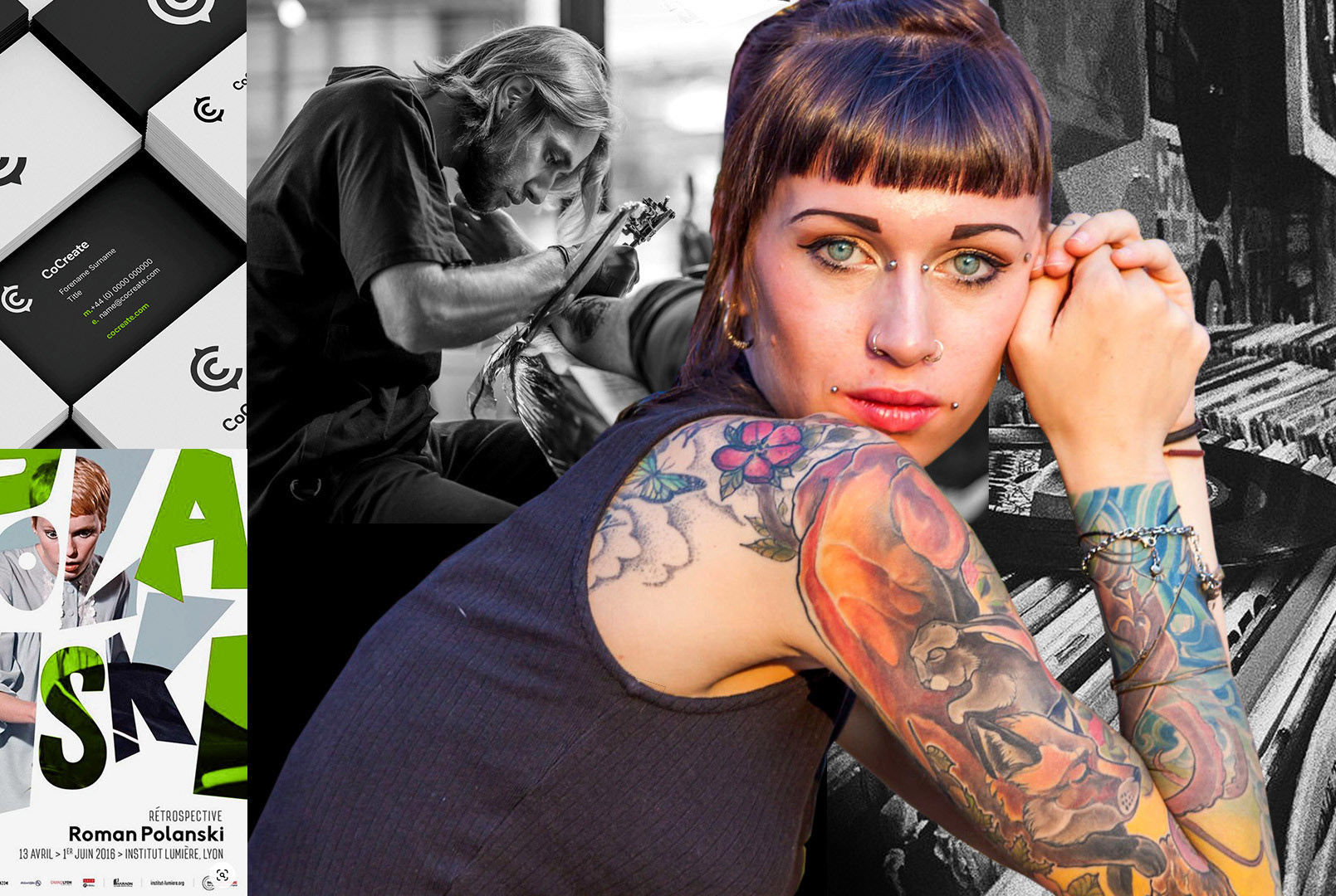
Route 2 - Juxtaposition

A lockup of the two ‘C’s in the CoCreate name forms the brand mark for this route, nested together to suggest collaboration between artist and client. A predominantly black-and-white palette gives the identity a more urban, editorial feel, punctuated with restrained hits of blue and green.

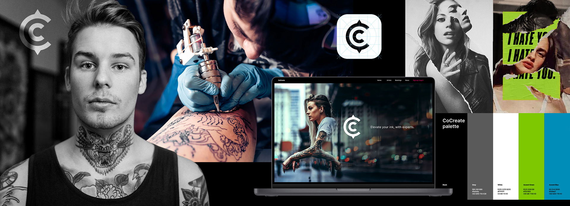
Colour and black-and-white photography are roughly cut and collaged together, placing contrasting characters and subjects in direct contact. Rips, tears and overlaps introduce a diary-like, scrapbook quality — creating a raw, expressive tone that feels personal rather than polished.
My role in the project:
Concept & design.
Credits:
Agency: Deftly Does It.